

From large expanses of white interwoven with a pop of colour we have now progressed or maybe gone back to pastel colours adorned with printed wall papers- a look straight out of yesteryears . Colours have progressed a long way in interiors this year . While the safe colour schemes of neutral colours enlivened with a hint of colour stayed, this year saw colours painting the décor scene in myriad hues. Here are some colours and themes that designers around the world believe will rule the décor scenes.
Mediterranean hues


Greek blue combined with white and shades of green straight out of a beachy town have been one of the most loved themes that designers believe will continue to adorn homes. With shades of blue and green accentuated with a hint of bright colours like yellow, all brought together by the forever go-to white is the perfect look that you can adopt to create the breezy and soothing environs of the Mediterranean islands.
Here’s how you could make your home as colourful as this post. VISIT: nipponpaint.co.in
Olive it up!


The one colour that made remarkable progress was olive green. Quickly becoming a more sober and very unique substitute for the traditional neutral colours, olive teamed up with a lot of different colours can be used to create varied ambiances. Ones seeking a cheerful and lively look teamed this magic colour with yellows and oranges and varied shades of greens. Some others adopted the “landscape” theme by bringing together stone grey , olive green and shades of green livened up with a hint of brightness to create the perfect natural look , and the ones intending to create a dramatic and sophisticated look combined olive with deep reds and aubergines .It’s warm and organic nature makes it adaptable with a large range of colours and this is one colour you must experiment with this season.
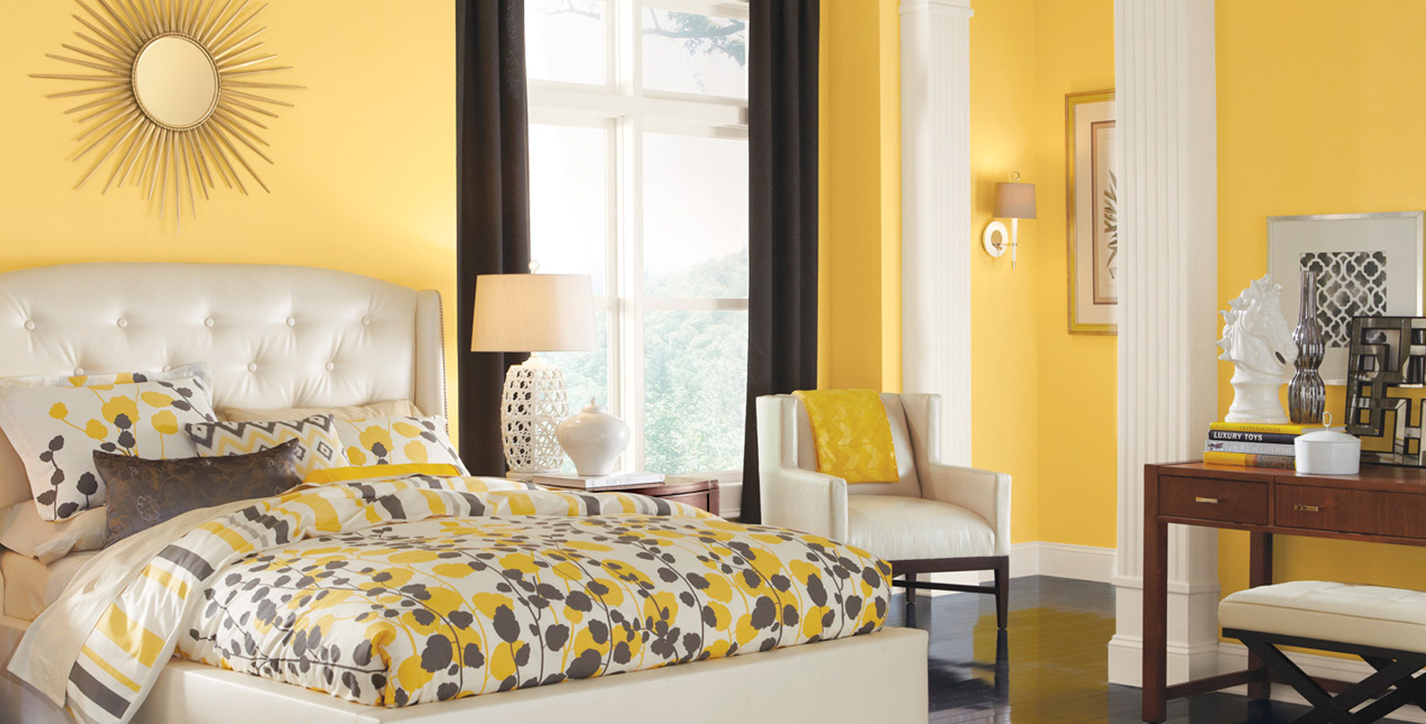
Pastel palettes


Going back to the 80’s and beyond, pastel colours have been doing the rounds for a while now and boy do we love them! Baby pink, powder blue, pale yellow and the like teamed with mysterious black to create a fine , clean look or these soothing colours matched with some gorgeous wallpapers has us wanting to do up our homes in these shades already.
Here’s how you could make your home as colourful as this post. VISIT: nipponpaint.co.in
Gorgeous grays


Another colour that has slowly and steadily made its mark is gray. With its hues and shades acting as smart substitutes for white and black, gray is another colour that can be combined with many colours depending on the look you want to achieve. Gray in itself can be used in its different shades to create a very sophisticated and formal look. Yellows, greens and shades of orange create a lively décor theme, while gray can be used as a neutral shade with pastels too. Combining it with deep dramatic shades of blue, maroon and purple makes for a colour scheme that screams class.
Coffee and cream


Another classy , tried and tested combination that is a safe go to if you want to create a sophisticated look , cream teamed with shades of brown and beige creates a sober , sometimes boring (if not done right) and very Victorian colour scheme. This combination is your go to choice if you want to create that comfortable and cozy environment without introducing dramatic colour schemes.
Bold blends


With a lot of quirky knick knacks available, throwing in contrasting colours to make a fun look is a trend loved by the younger lot. Neon green with sunny yellow sobered with a hint of white, or oranges and yellows humbled with gray, bold colours are a favourite among people who do not mind a lot of colour adorning their walls and upholstery.
Here’s how you could make your home as colourful as this post. VISIT: nipponpaint.co.in
Keep it classy

Pairing deep shades of red , purple , blue and green with grays , black , cream or the magic colour olive is the perfect choice if you intend to create a dramatic and lavish colour scheme for your indoors. Soft velvets, ornate wallpapers, or elegant silks in these deep colours and balancing them out with neutral colours make for a perfectly rich and classy look.
Here’s how you could make your home as colourful as this post. VISIT: nipponpaint.co.in